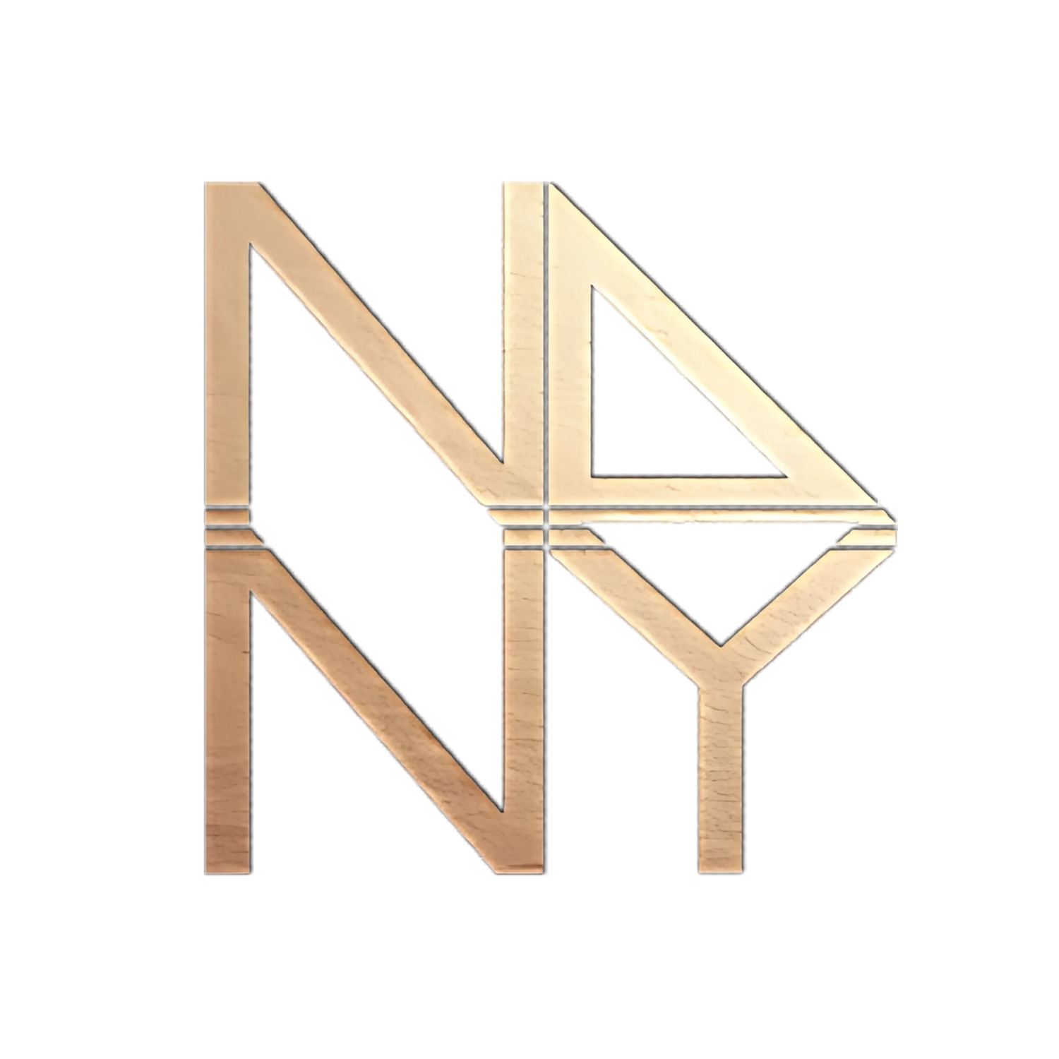
Inspo Mood: Geofluid Contrast
When it comes to designing anything, be it a website, a product, or even a room in your house, choosing the right color palette is one of the most important decisions you'll make. Colors can convey emotions and messages and can set the tone for an entire project. But sometimes, the simplest color palette can be the most effective: black and white.
Black and white is a classic color combination that has been used in design for centuries. It's bold, striking, and has a timeless quality that never goes out of style. When used in contrast with each other, black and white can create a sense of balance and clarity that is hard to achieve with other colors.
But why stop at just black and white? Incorporating geometric shapes into your design can add another layer of interest and texture to your project. Geometric shapes can be used to create contrast and depth and can help to guide the viewer's eye around the design.
The Inspo Mood board here provides a great example of how black and white can be used in combination with geometric and fluid shapes to create a visually stunning design. The contrast between the two colors is sharp and eye-catching, drawing the viewer's attention to the design. The use of geometric and fluid shapes adds another layer of interest, creating texture and depth.
Showcases various shapes and fluid movements, from simple triangles and squares to more complex polygons and spirals. Each adds its own unique visual interest to the design, helping to break up the monotony of the black-and-white color palette.
But what makes this design so effective is the simplicity of the color palette and the shapes used. Sticking to just two colors and contrasting shapes makes it easy to understand and easy on the eyes.
So, how can you incorporate these design principles into your next project? Here are a few tips:
Start with black and white. Don't be afraid to keep things simple by limiting your color palette to just these two colors. It's a classic combination that will never go out of style.
Experiment with shapes. Try incorporating different shapes and movements into your design to add texture and interest. Play around with different combinations and see what works best for your project.
Use contrast to your advantage. By using black and white in contrast with each other, you can create a visually striking design that draws the viewer's attention.
Keep it simple. Don't overcomplicate your design by using too many colors or shapes. Stick to a few key elements and let them shine.
In conclusion, the simplicity of black and white contrast, in combination with contrasting shapes and textures, can take any digital or real-world design to the next level. It's a classic color combination that will never go out of style. So, the next time you're starting a new design project, consider incorporating these principles into your work and see what kind of results you can achieve, a visually stunning design that is striking and easy to understand.
